Websites are now most commonly viewed on Smart Phones and Tablets |
This means if your website is built in the 'traditional' way it will probably mean it is too tiny to read the text on a mobile device. Visitors to your website can of course use various pincer gestures to zoom in and out but they will soon become annoyed by this.
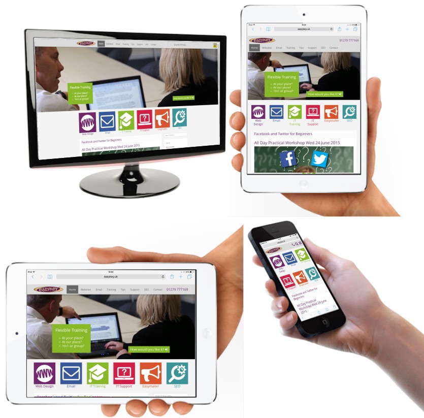
Easykey builds websites that respond to the device that is accessing it. In other words it will change shape and layout so it is easy to access whether it is on a desktop, laptop, notebook, tablet or smartphone.
This is what the homepage of easykey.uk looks like on various devices:

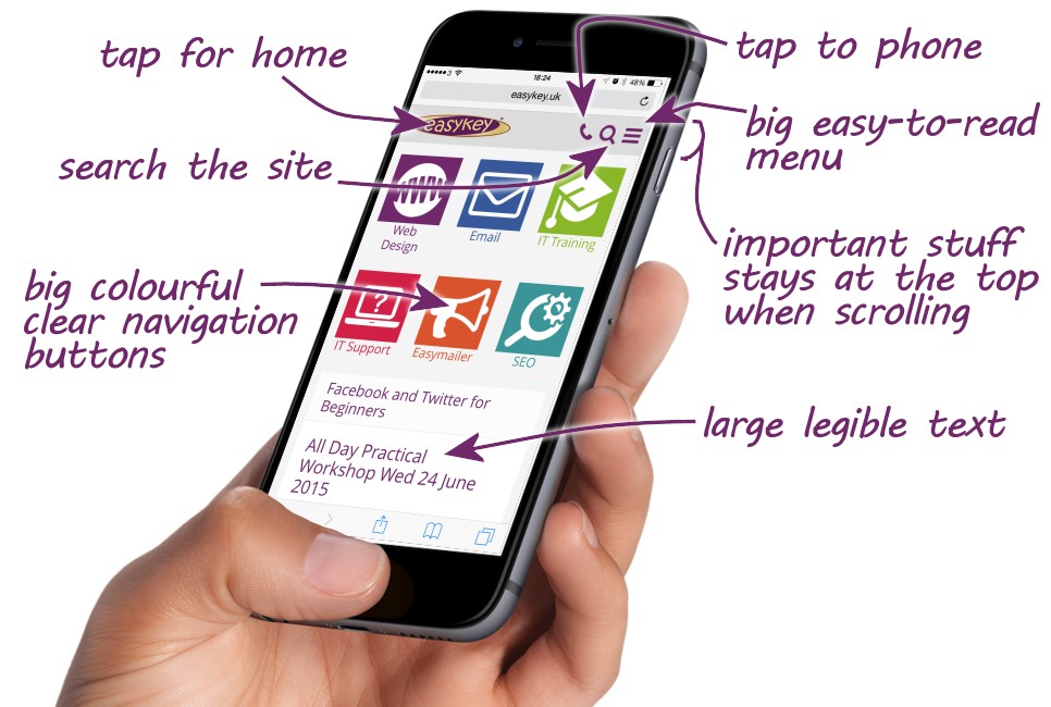
And if you were to look at it on an iPhone it would include the following handy mobile features...

Why should you care?
If your competitor has a website that is mobile-friendly it will be favoured by visitors who will stay there longer (as long as the content is engaging!)
Trying viewing this article on your big screen then on a mobile device - you should notice that the images above resize and fit.
Since April 2015 Google has begun to penalise searches carried out on mobile devices for sites that are not seen as mobile friendly.